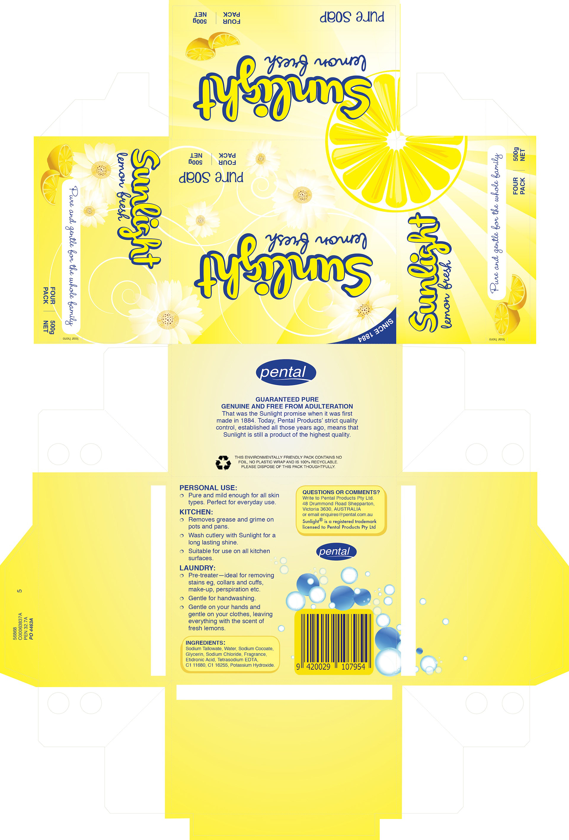
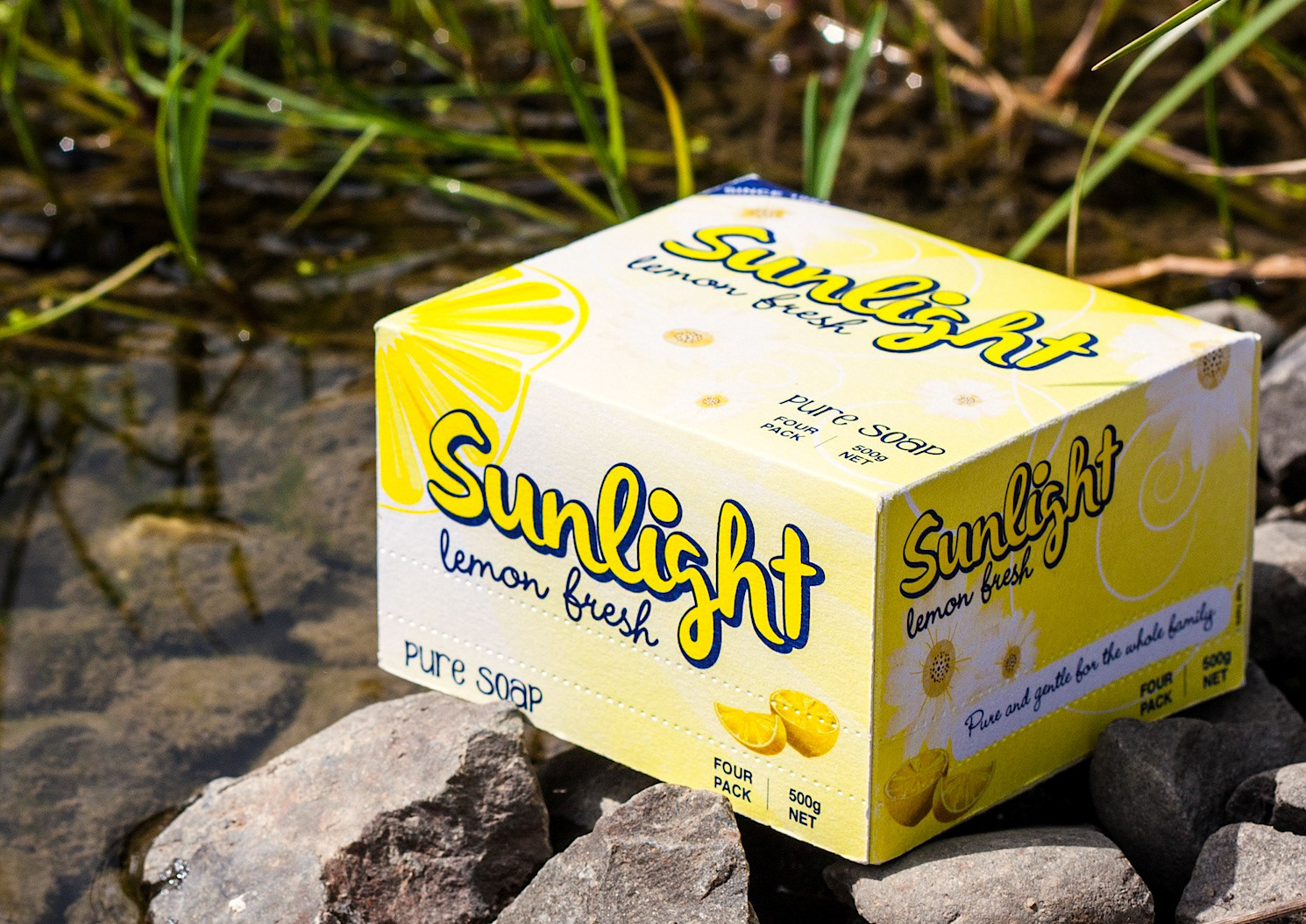
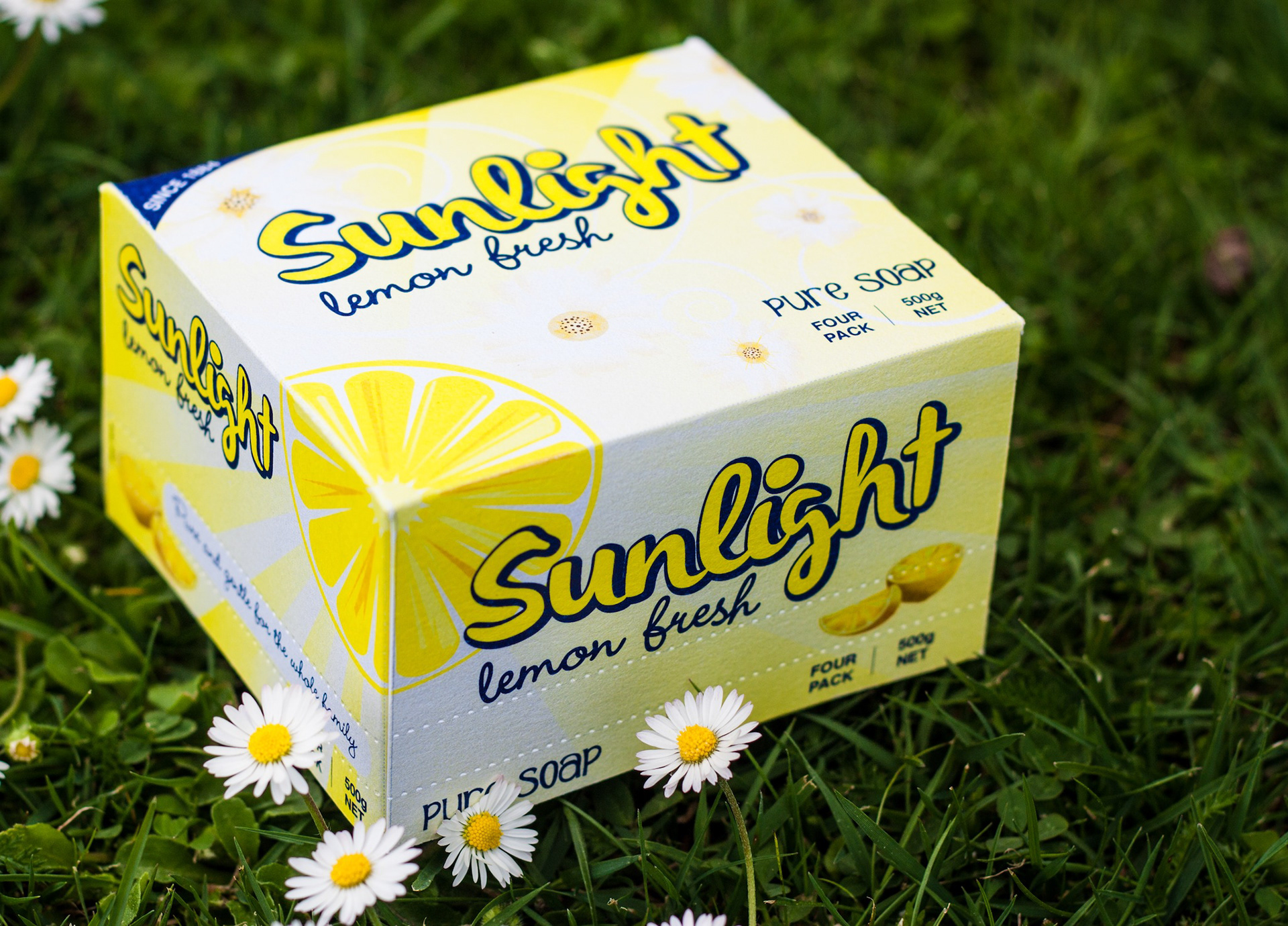
This project was to choose an existing product found on a supermarket shelf and redesign it. I chose Sunlight Soap because essentially it has not changed from the days I remember it being on my Nana's shelf. With the addition of liquid soaps and detergents, I feel it has lost it's appeal with the younger generation. However, there is a growing desire to return to basics and to use less cleaners in the home, therefore providing a better environment for the family. With this in mind, I chose a fresher and modern look for my packaging; also moving away from the long box to more friendly square shape, while still keeping the heritage colours of navy and yellow. I printed onto pearlescent card stock to give the daisies and sunrays on the packaging luminance.
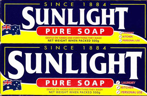
above: The package as it was.